Taking the heat: A weathercaster’s view
Guest Column | Dan Satterfield, broadcast meteorologist
Feb 7, 2012 - by Staff
Feb 7, 2012 - by Staff
Dan Satterfield has worked as an on-air meteorologist for 32 years in Oklahoma, Florida, and Alabama. He has also helped conduct training sessions for weathercasters on climate change. Dan’s Wild Wild Science Journal can be found in the AGU Blogsophere.
February 6, 2012 • The past twelve months have seen some of the most extreme weather of modern times, especially in North America. NOAA announced in January that in 2011 the United States suffered through a total of 14 weather disasters that cost over a billion dollars each. Among these were the Texas drought that was literally off the charts, and of course the deadly tornadoes in Alabama and Joplin, Missouri, among other places. More of the United States was either extremely wet or extremely dry in 2011 than in any other year on record.

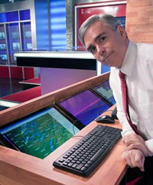
Dan Satterfield. (Image courtesy Marian Satterfield.)
If any if these events made you wonder if climate change was involved, you’re not alone. That very question is one of the most commonly heard by TV weather forecasters like me. How should we answer it as professionals? Are there correct, science-based answers we can bring to our viewers? I think so.
One thing many science communicators learn is that the public often looks for one, and only one, cause to significant weather events. What caused the Texas drought? Did El Niño cause the floods in the Dakotas last spring?
The answer, of course, is that events like these are the result of a complex set of atmospheric variables, and the question of climate change and its hand in weather extremes is no different. Ocean-induced pressure patterns like the Pacific Decadal Oscillation (PDO) and the North Atlantic Oscillation (NAO) play a big role in the kind of winter we see in North America, but climate-induced warming of the air can affect these patterns in subtle ways that are as yet not fully understood.
We know our planet is warmer now than it was a century ago, and most of the warming has taken place in the last 50 years. This warmer atmosphere holds more water vapor. Moreoever, the reduced amount of solar energy reflecting off the diminishing Arctic sea ice changes the energy balance of the Arctic regions. Jennifer Francis (Rutgers University) has been studying the impact of the dramatic loss of Arctic sea ice. At a conference I attended in January, she put it very succinctly: “The question is not whether the loss of Arctic ice is affecting the large-scale atmospheric circulation; it’s ‘How can it not?’.”
These facts alone strongly suggest that climate change must have at least some role in some extreme weather events. And one would expect this effect to have an increasing role as the planet warms further. But extremes in weather are normal, a fact which makes the job of forecasting all the more interesting. So the type of research that attempts to determine exactly how much of a particular extreme is related to climate change will be increasingly important. I like to think of it this way: while we cannot say that increased greenhouse gases directly caused a particular extreme, they may have been driving the getaway car.

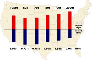
This graphic shows the ratio of record daily highs to record daily lows observed at about 1,800 weather stations in the 48 contiguous United States from January 1950 through September 2009. Each bar shows the proportion of record highs (red) to record lows (blue) for each decade. The 1960s and 1970s saw slightly more record daily lows than highs, but in the last 30 years record highs have increasingly predominated. The ratio was about two-to-one for the 48 states as a whole in the decade from 2000 to 2009. For 2011 (not shown in graph), the ratio was about three-to-one. [ENLARGE] (©UCAR, graphic by Mike Shibao.) News media terms of use*
I’ve come to the conclusion that using a graphic inside the weathercast to teach climate is the best way to go. The image needs to be highly relevant to the viewer. Two images I know of work very well in this way.
NCAR scientist Gerald Meehl and colleagues have produced a study of the increasing number of U.S. daily record high temperatures versus daily record lows over the past few decades. Record highs are a normal weather extreme, but the image at right shows an increasing number of them compared to record lows. This is a powerful image that clearly shows the difference between weather and climate, and I used it on air recently.
Another very telling image (at bottom) was produced by Texas state climatologist John Nielsen-Gammon last autumn. It shows the magnitude of the Texas drought and heat of 2011 compared to more than a century of Texas weather records. The extreme summers of the past are there, but 2011 is so far off the chart, it is obvious that this summer was more than than the hottest summer of a generation. Nielsen-Gammon estimated that roughly 0.9°F (0.5°C) of last summer’s 5.4°F (3.0°C) departure from normal across Texas could be attributed to global warming. This was another image that had a big impact on my viewers and blog readers.
In addition to sharing such images, I have found it important to point the viewer to a trusted blog or other website for more information (such as this AtmosNews site, for example), which allows them to explore the science for themselves.
As the mountain of evidence showing a changing climate piles up, the burden of proof shifts. While it may not be possible to ascribe just how much climate change influenced a particular event, to my mind the question becomes, “How can one claim that this year’s weather disasters were not influenced by these changes?”
One of the most popular metaphors for these events is rolls of the dice. A roll of the weather dice will get you a brutal summer, or a major blizzard from time to time, but climate change has loaded the weather dice so that these events are more common now. Another metaphor is the effect of steroids on a baseball player (see this AtmosNews animation).
Some in this business shy away from at least engaging viewers about climate. I fear that in the long run, this will hurt them. The increasing numbers of people who do understand the issue will feel as if they are hearing only half the story. According to the “Six Americas” surveys conducted by the Yale Project on Climate Change Communication, we know that only about 10% of Americans are outright dismissive of climate change. A majority of people now understand the planet is warming and that this is partially a result of human activities.
In the new media age, the broadcast meteorologists who will succeed on the air (and online) will be those who are much more involved in science—sharing this with their increasingly informed viewers in a variety of ways. The American Meteorological Society’s Committee on the Station Scientist was formed for just this reason. I tell many TV meteorologists that if they are not doing a lot more than just presenting a three-minute weathercast, they are in the wrong business.
Thirty years ago, when I began as a broadcast meteorologist, the best answer to questions about weather extremes was to point out that the record books are full of extreme weather events. This is now a badly incomplete explanation, and no amount of debating will change the effects of increased greenhouse gases on our atmosphere. I believe astrophysicist Neil de Grasse Tyson sums it up best: “After the laws of physics, everything else is opinion.”
When Texas temperatures and rainfall are plotted against each other for the last 117 years, the strong ties between heat and drought become evident—as well as the unprecedented nature of 2011 (red dot at upper left). The curves shown are best-fit second-order polynomial (black) and best-fit logarithm (red). [ENLARGE] (Graphic courtesy John Nielsen-Gammon, Climate Abyss.)