Five things to know about carbon dioxide
What does 400 parts per million tell us?
May 15, 2013 - by Staff
Temporary impacts to NSF NCAR Road, Parking Lot and Trails
View more information.May 15, 2013 - by Staff
Bob Henson • May 15, 2013 | Even if a milestone is arbitrary, it can strike a note that resonates deeply. Last week’s announcement that carbon dioxide concentrations in the atmosphere had touched 400 parts per million was just such a moment.
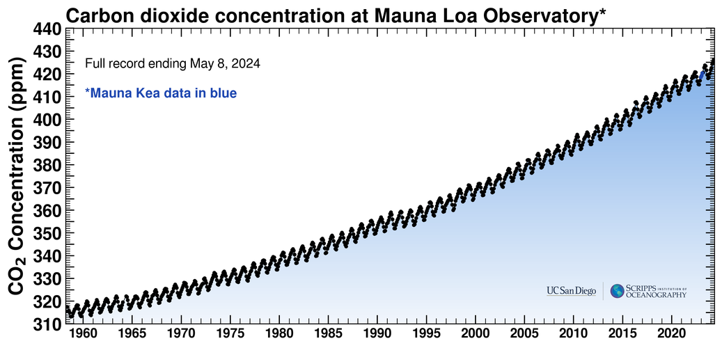
One of the most iconic graphs in atmospheric science, the Keeling Curve—named for the researcher who began measuring carbon dioxide atop Hawaii's Mauna Loa in the late 1950s, Charles David Keeling—shows the annual rise in the amount of atmospheric CO2 in parts per million. The sawtoothed pattern reflects the asymmetry in plants' annual uptake of carbon dioxide that results from most land areas being located in the Northern Hemisphere. (Graph courtesy The Keeling Curve, Scripps Institution of Oceanography.)
CO2 levels have increased every year since measurements began atop Hawaii’s Mauna Loa in 1958, so the new benchmark comes as no surprise. But it does serve as an occasion to reflect on the immensity of what’s happening to Earth’s atmosphere and the role we’re playing in it. Here are five examples.
CO2 is heavy stuff. Because carbon dioxide is odorless, tasteless, and invisible, it’s all too easy to think of it as lightweight. Actually, fossil fuel burning results in more than 30 billion metric tons of CO2 being added to the atmosphere each year. That’s more than 9,000 pounds for every person on Earth.
As UCAR trustee Alan Robock (Rutgers University) points out, back when horses and buggies were the main form of transport, there was no debate about the impact of those emissions: you smelled them, stepped over them, shoveled them. Today, you can see and smell fossil fuels burning, especially if you're near a refinery, a coal-burning power plant, or a busy highway. But the carbon dioxide itself slips into the atmosphere unnoticed, which makes it easy to ignore.
Apart from its long-term growth due to human activity, atmospheric CO2 waxes and wanes each year simply because plant growth is concentrated in the Northern Hemisphere. This explains the sawtoothed aspect of the Keeling Curve shown above.
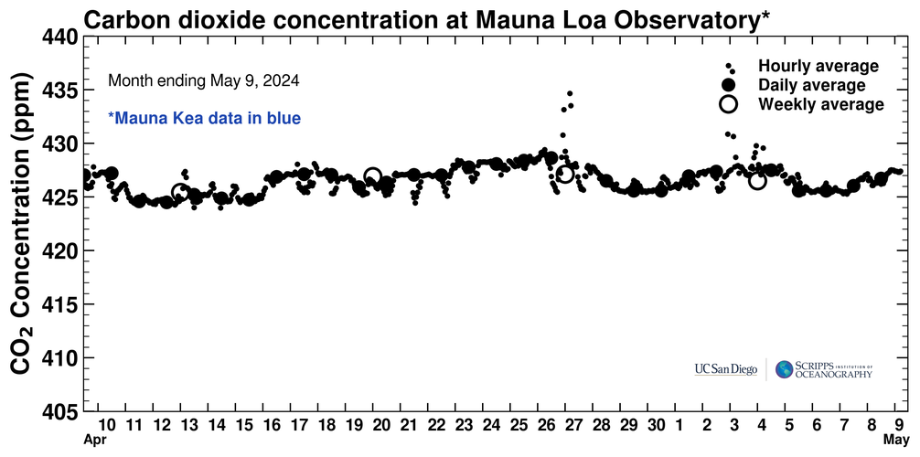
CO2 also varies slightly from hour to hour, day to day, and week to week, as you can see on the chart below, which shows the past month’s data from the Mauna Loa Observatory where NOAA and Scripps carry out measurements. Hourly readings bumped above 400 ppm weeks ago, but the first 24-hour average above the benchmark occurred on May 9.
Because of the seasonal rise and fall of CO2, we can expect the average value to dip a notch or two below 400 ppm later this year, but it should rise to at least 401 or 402 ppm by this time next year. Within a couple more years, the Mauna Loa value will remain above 400 ppm for the rest of our lives—or at least for the decades it would take to carry out massive reductions in global emissions.
Less than half of CO2’s mass comes from fossil fuel. When oil, gas, and coal are burned, the carbon in those fuels joins with oxygen atoms already in the atmosphere to create CO2. Since the atomic mass of carbon is 12 u, and that of oxygen is 16 u, this means that most of the weight of a CO2 molecule comes from oxygen in the air instead of carbon in the ground. In other words, every ton of carbon that’s extracted and burned puts 3.67 tons of CO2 in the atmosphere. (Which is just one of many reasons why we can't easily "scrub" CO2 from the atmosphere and put it in the ground: for one thing, we’d have to transfer and store a lot more mass than we started out with.)
CO2 concentrations aren’t the same everywhere. In general, CO2 is well mixed in the atmosphere, mainly because it’s so long lived. Individual CO2 molecules do cycle back and forth in annually balanced exchanges between the atmosphere, biosphere, and oceans. However, the net addition of CO2 to the atmosphere from human activities will take a very long time to be permanently absorbed by oceans, plants, and soil. If you add a pulse of extra CO2 into the atmosphere, only about half of it will be gone from the air a century later. The rest will leave the atmosphere even more gradually, over hundreds and even thousands of years.
Since CO2 has plenty of time to disperse throughout the global atmosphere, it’s possible to use values collected at a remote site like Mauna Loa—more than two miles above the Pacific, and many hundreds of miles from any continent—as a proxy for global concentrations.
Even so, there are significant differences from place to place and one time to another, as vividly illustrated by NOAA’s CarbonTracker website. CO2 is regularly measured at several other locations, such as Australia's Cape Grim and Ireland's Mace Head. A major NCAR-led field project called HIPPO sampled the atmosphere between the Arctic and Antarctic on five occasions from 2009 to 2012, measuring seasonal and latitudinal variations in CO2 from aboard HIAPER, the NSF/NCAR Gulfstream V aircraft. Researchers are now using that wealth of data to gain a better picture of how CO2 amounts vary within the long-term global increase.
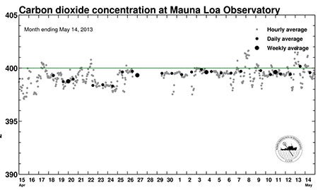
Although the hour-by-hour averages at Mauna Loa showed carbon dioxide concentrations bumping above 400 parts per million in late April 2013, the 24-hour average did not reach the 400-ppm threshold until May 9. (Graph courtesy The Keeling Curve, Scripps Institution of Oceanography.)
We’ve seen a revolution in modeling CO2-related impacts. When the Mauna Loa record began in 1958, UCAR and NCAR were still two years away, and many other atmospheric research efforts were in their infancy. Scientists had known for decades that global increases in CO2 could theoretically warm the atmosphere, but it wasn’t yet widely accepted that human activity would trigger this process. This question had only been analyzed through laborious manual calculations, such as those carried out by Svante Arrhenius around 1900.
In the late 1950s and into the 1960s, as large-scale computing came on the scene, the first general circulation models (GCMs) were built at a handful of institutions, including NCAR; the University of California, Los Angeles; and the Geophysical Fluid Dynamics Laboratory (now part of NOAA). Researchers quickly discovered how to increase the sophistication of the physics in these models so that they could depict how an infusion of CO2 would trigger global temperature increases.
In 1979, a commissioned study called the Charney Report projected that a doubling of atmospheric CO2 would cause global temperature to rise by 1.5–4.5°C. This best-estimate range has changed only slightly in 34 years, even as researchers have learned much more about ocean-atmosphere interactions, regional precipitation trends, and other facets of enhanced greenhouse warming.
Major regional shifts are occurring in CO2 emissions. Back in 1997, the U.S. Senate rejected the Kyoto Protocol, 95-0, largely because the plan didn’t include binding emission targets for developing countries. Nation-by-nation emissions data for 1997 showed that the U.S. was producing about 23% of the world’s fossil-fuel-based CO2 emissions, with China producing about 14%.
Today, the picture is starkly different. In 2011 (the most recent year with data available), China led the world with about 26% of global emissions, with the United States in second place at about 15%. U.S. emissions actually dropped about 2% in 2011 versus 2010.
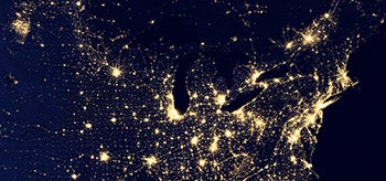
In this NASA composite satellite view of the nation at night, produced in 2012, flares from natural gas production in western North Dakota (cluster of lights in upper left corner of image) rival the light output from major U.S. cities. (Image courtesy NASA.)
One important aspect of recent CO2 emission trends is the massive shift in manufacturing from the United States to China. In essence, some U.S. emissions are being “outsourced,” a point raised by an NCAR study back in 2005.
However, other factors also appear to be at work in the U.S. emissions drop. Energy efficiency measures have gained traction. Solar and wind energy have boomed (making a real difference, according to a recent study). The post-2008 economic slump has slowed the overall economy.
Another factor: natural gas that’s newly plentiful as a result of fracking. It produces only about half as much CO2 per unit of energy as coal, and it pairs well in many ways with renewables. However, the overall benefits to climate from the nation’s coal-to-gas switch may be less than expected when other emissions, such as methane and sun-blocking particulates, are taken into account, as noted by NCAR scientist Tom Wigley in a 2011 study.
And some of the displaced U.S. coal is now being exported to Europe and Asia, where it ends up adding to CO2 emissions after all. As John Broderick (Tyndall Centre for Climate Change Research) pointed out to National Geographic News, “Switching from coal to gas only saves carbon if the coal stays in the ground.”
Put another way, the atmosphere doesn’t care which nation emitted a molecule of greenhouse gas—only whether it’s in the atmosphere or not.
How will CO2 emissions unfold in coming decades? That’s devilishly difficult to predict. Few people could have told you a decade ago that China’s emissions would grow quite as rapidly as they have, or that U.S. natural gas supplies would increase so dramatically. All the more reason, then, to build a variety of scenarios so that it’s clear what the best- and worst-case emission outcomes might be—and how those, in turn, might affect both climate and society.
Previous assessments by the Intergovernmental Panel on Climate Change drew on a carefully developed range of scenarios for how global society might develop, then calculated how those scenarios would affect emissions. The IPCC's Fifth Assessment Report (to be published in four phases from late 2013 to late 2014) is using a new approach. The climate modeling will draw on possible emission trajectories using a new tool called representative concentration pathways (RCPs). Subsequent studies will then determine what mix of human actions might take us down each pathway.
The new process is described in a 2010 Nature article. In a 2012 analysis published in Global Environmental Change, a team that includes NCAR’s Brian O’Neill explores how socioeconomic pathways could dovetail with the new RCPs.
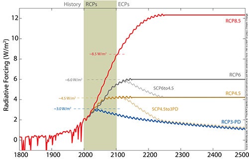
This graph shows four different representative concentration pathways (RCPs), which describe how the impact of greenhouse gases might evolve in the coming centuries. Each curve shows the evolution of radiative forcing—or how the energy being trapped by greenhouse gases at any point in time is forcing climate toward warming or cooling. Experts are envisioning what trends in energy use and development might lead to a given RCP. (Graph courtesy Potsdam Institute for Climate Impact Research.)